
Circle The Wagons – Brand Identity
Circle The Wagons Brand Identity
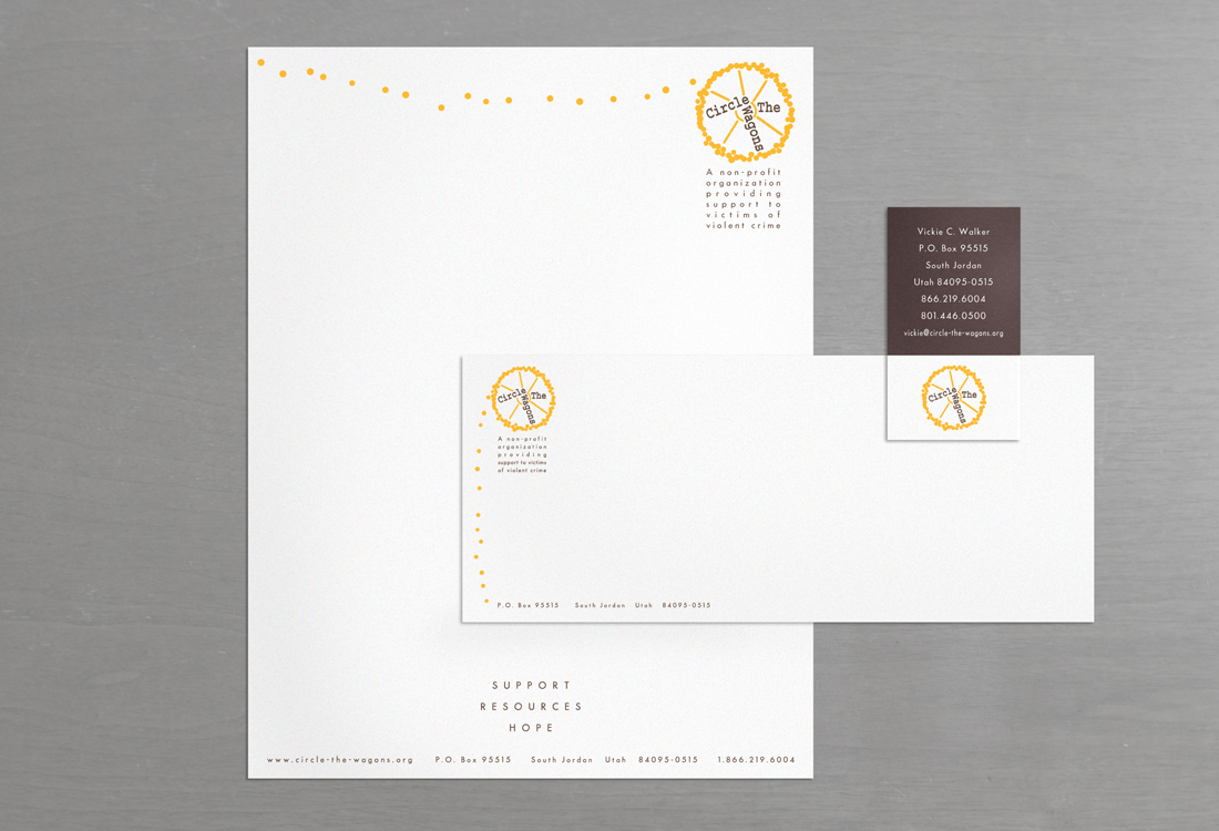
Circle The Wagons Letterhead, Envelope and Business Card
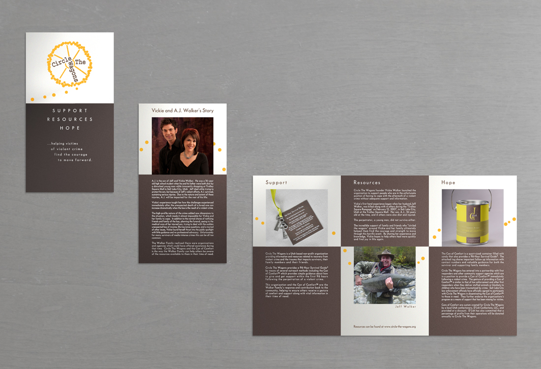
Circle The Wagons Brochure
About This Project
Circle The Wagons connects innocent victims of violent crime to essential information and resources that will help them in the immediate hours after the crime, as well in the days and months that follow. Circle The Wagons support helps victims, their families and friends with survival and healing, lets them know they do not have to face their situation alone, and helps them find the courage to move forward.
Vickie Walker founded Circle The Wagons after surviving the horrible ordeal of her husband and son being shot during the “Trolley Square Shooting” in 2007. Her husband died while her son was seriously injured but miraculously survived. For more information visit the Our Story page on Circle The Wagons website
Stippich Design’s connection to this project was very personal as Linda and Vickie formed a friendship during their time working for the same national design firm. After sitting down with Vickie and listening to her thoughts and aspirations for what she hoped Circle The Wagons could accomplish we collaborated on the development and design of the brand identity. The wagon wheel stood out as a strong visual element for several reasons it is a circle in shape it has both an outside circle (groups of people coming together in support) and an inside circle (the individual or family vicitimized by violent crime) the spokes reinforce that connection of support provided by the outside circle and the idea that as a wheel picks up momentum due to increased numbers of people coming together it will put an end to these horrible events of violent crime. A dark brown is used for the wordmark in the center and it radiates out as wheel spokes to represent the darkness of the ordeal of dealing with the aftermath of a violent crime and the need for support in dealing with it. The dots that form the outside circle are in a orange-yellow to represent that warmth and feeling of hope that the community around can provide to victims to aid in finding the courage to move forward towards healing from such a violent event. For the letterhead and envelope design we further expressed this idea of momentum by adding more of the yellow dots (people) in a line indicating kind of a pushing movement.


